Freshly
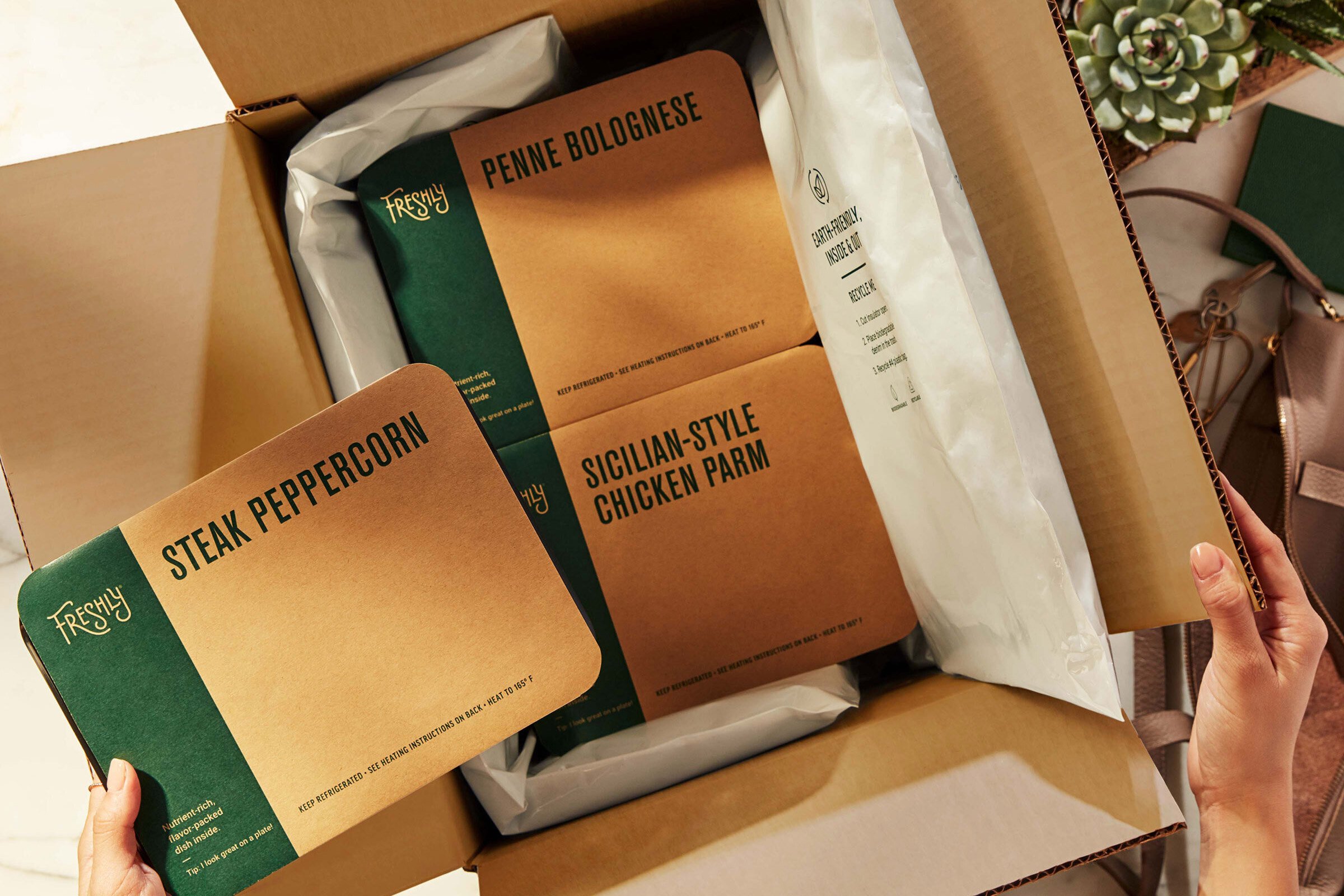
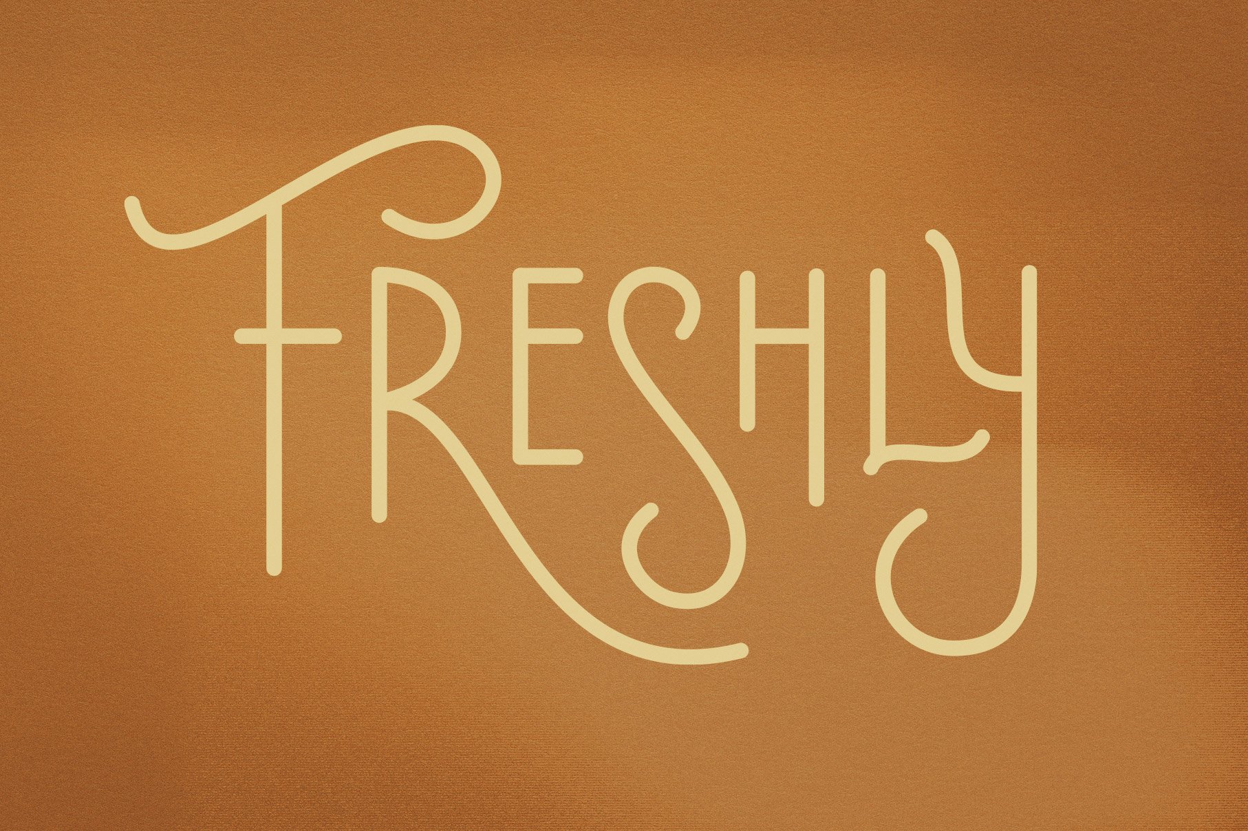
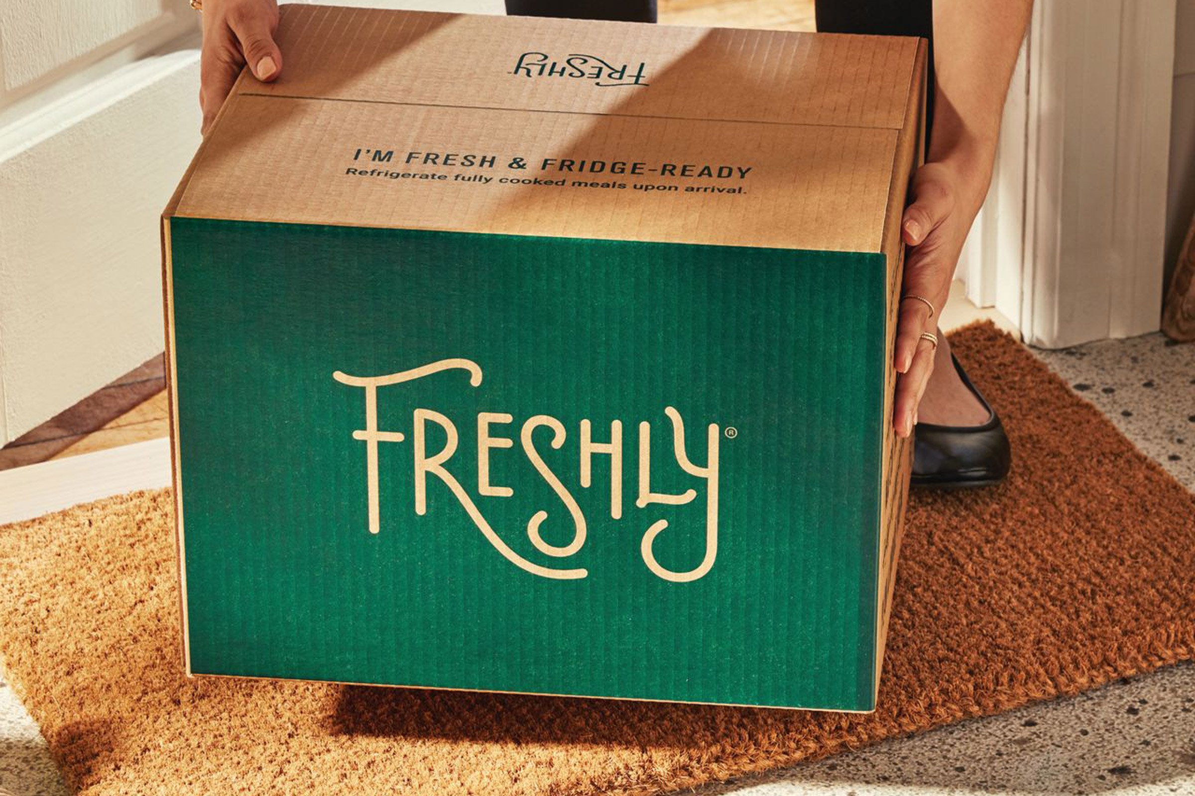
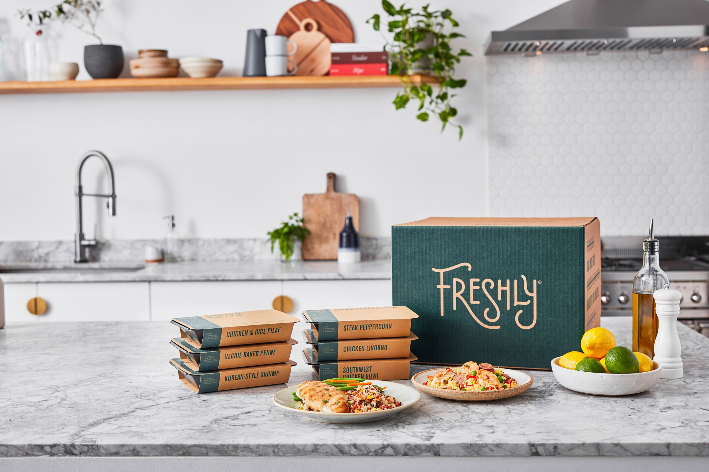
An innovator in the prepared-foods market, Freshly brings healthful, ready-made meals directly to the doorsteps of busy individuals and families. In re-defining the Freshly brand, we looked to create a differentiated identity and packaging system, embracing a visual language that cues craft, consideration, and integrity, demonstrating that nutritional value and deliciousness don’t have to be amiss with prepared meals. A bespoke logotype with hand-drawn, homespun lettering expresses joy and whimsy, reminiscing on hand-painted window signage of neighborhood restaurants or the decorated labels of packaged, artisanal provisions. This charming expression is presented cleanly with a utilitarian type system and a modest yet sophisticated palette that includes a humble, utilitarian kraft paper to further suggest the wholesome potential of delivered meals. Following the rebranding effort, Freshly experienced outsized success and was acquired by Nestlé for 1.5 billion in 2020.
Bespoke Wordmark
Creative Direction – Mythology
Images courtesy of Freshly